Selected Work
Artifacts
Not everything. Just enough to understand how I think.
AIArchitecture
01 / 05
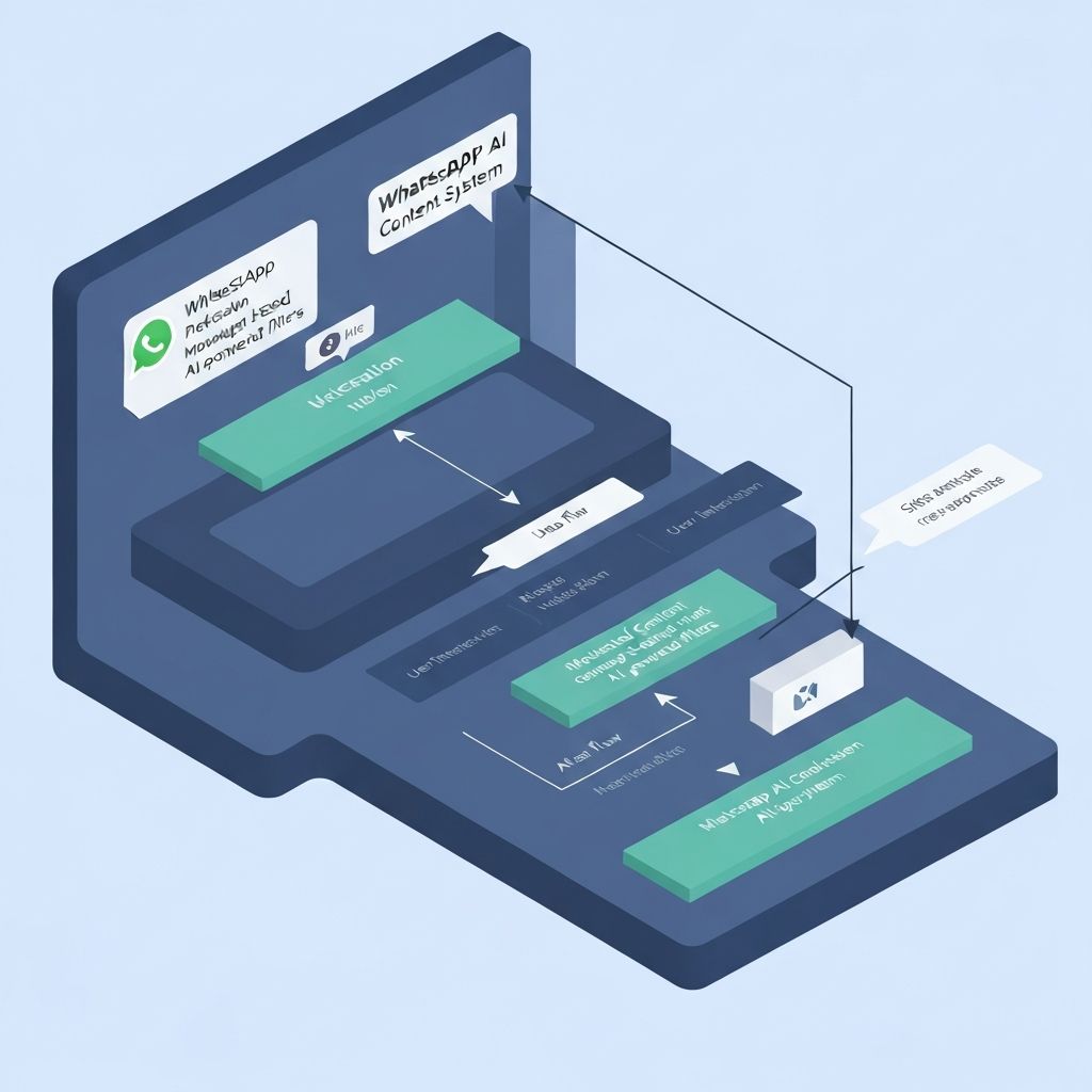
WhatsApp AI System
Removing logistics from creativity.
The Core Decision
No dashboards. I designed the system to be spoken to. Creators message it like a person.
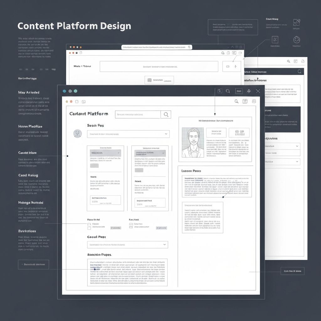
TypographyDesign
02 / 05
Platform Redesign
Typography as the product.
The Core Decision
Navigation disappeared when reading began. The interface stepped back.
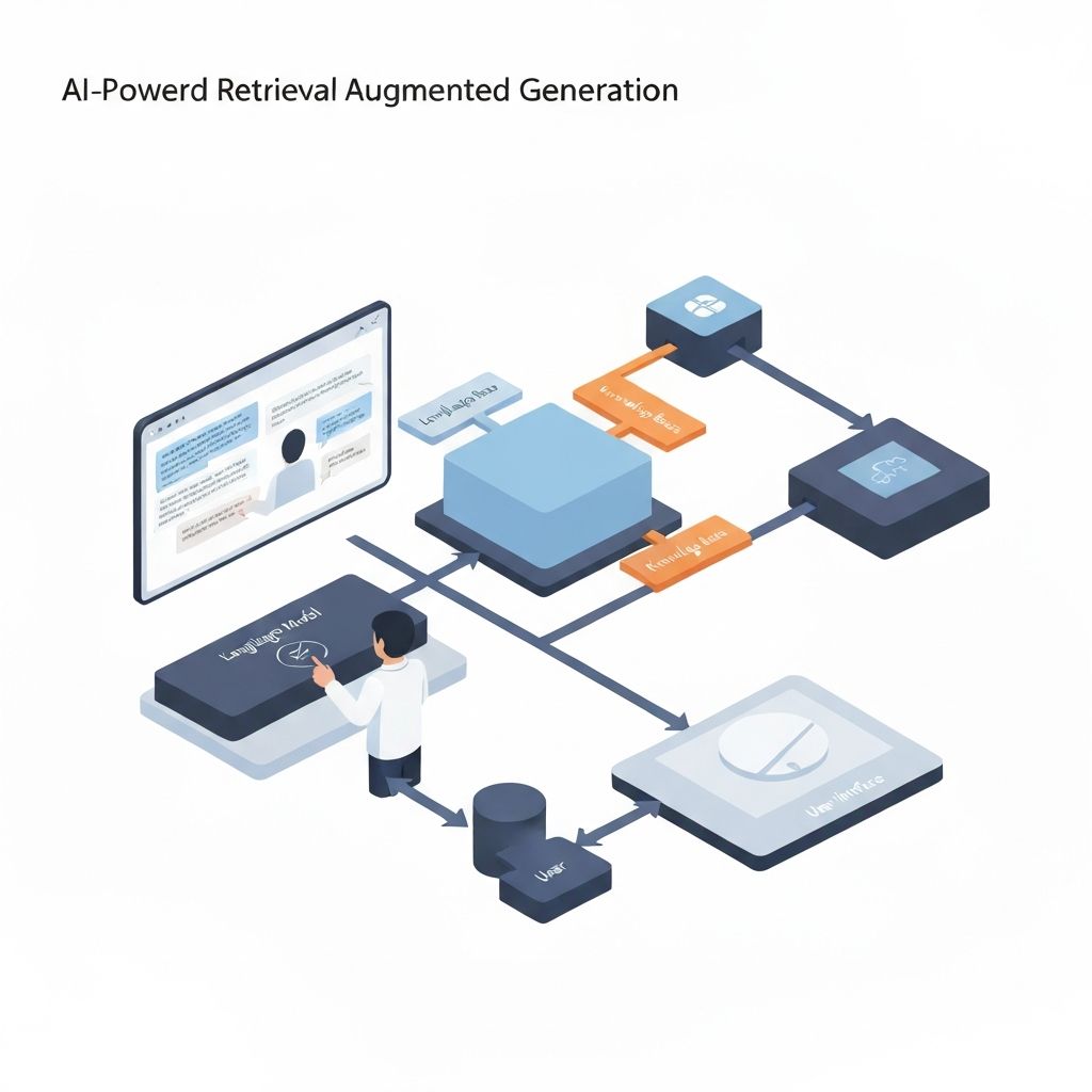
AIRAG
03 / 05
RAG Systems
Trust over cleverness.
The Core Decision
Ground everything. The system was taught to say 'I don't know'.
The Studio
Aikra
Helping businesses build apps that actually work the way their users think. We don't build features. We build systems that disappear into the work.
Other work exists. This is enough to understand how I think.