2023
B2B SaaS Platform Redesign
Product Designer
Focus Areas
Context
The Challenge
How do you simplify without removing the depth that enterprise users depend on?
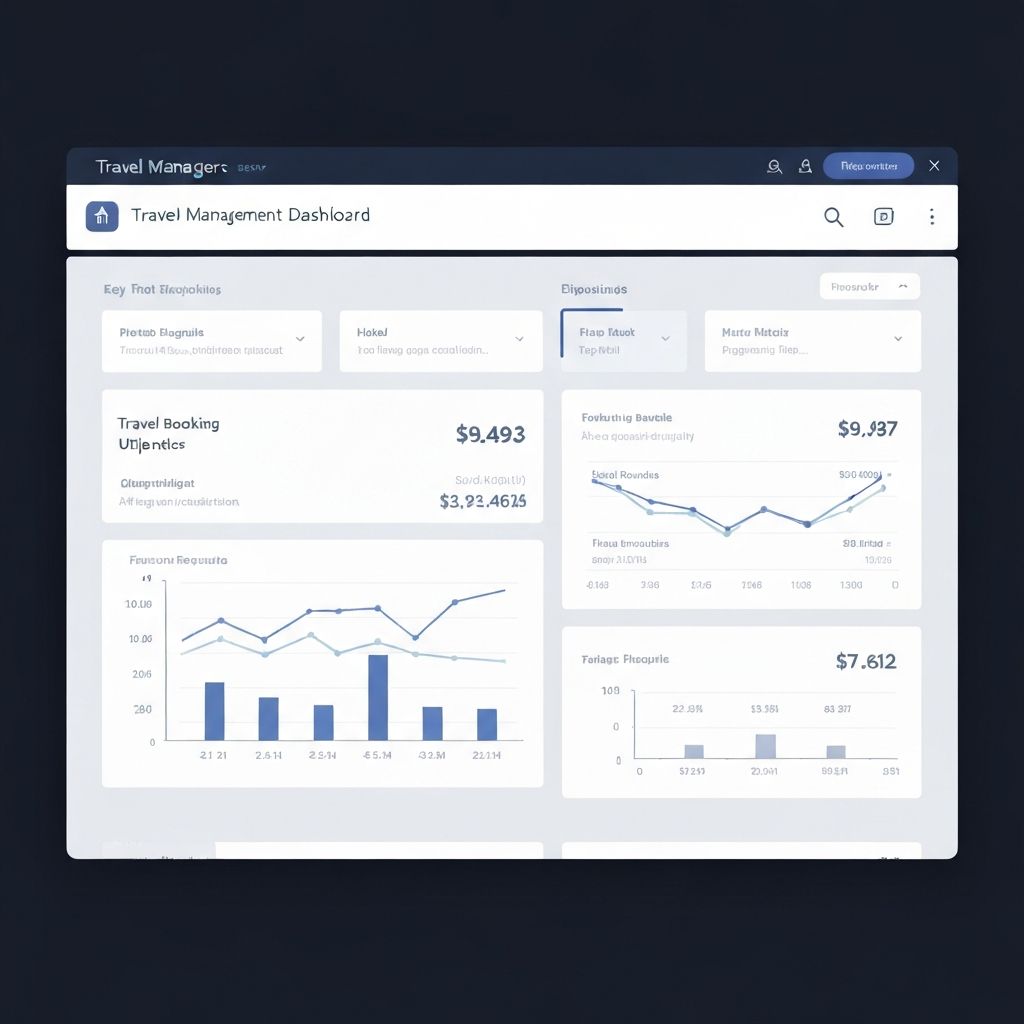
The Solution
Didn't remove features—reorganized the entire information architecture. Removed visual noise. Used white space strategically. Designed for scanability first, depth second. Made common tasks obvious. Buried advanced settings where power users could find them.
The Impact
Support tickets dropped 40%. User satisfaction scores improved significantly across all user segments. Onboarding time for new users cut in half.
Learnings
Simplicity isn't about having fewer features. It's about making the right ones obvious and the rest accessible.
Whitespace is a tool, not decoration. It creates cognitive rest.
Information architecture is the unsung hero of product design.
Ready to see what else I've built?
Back to all work →